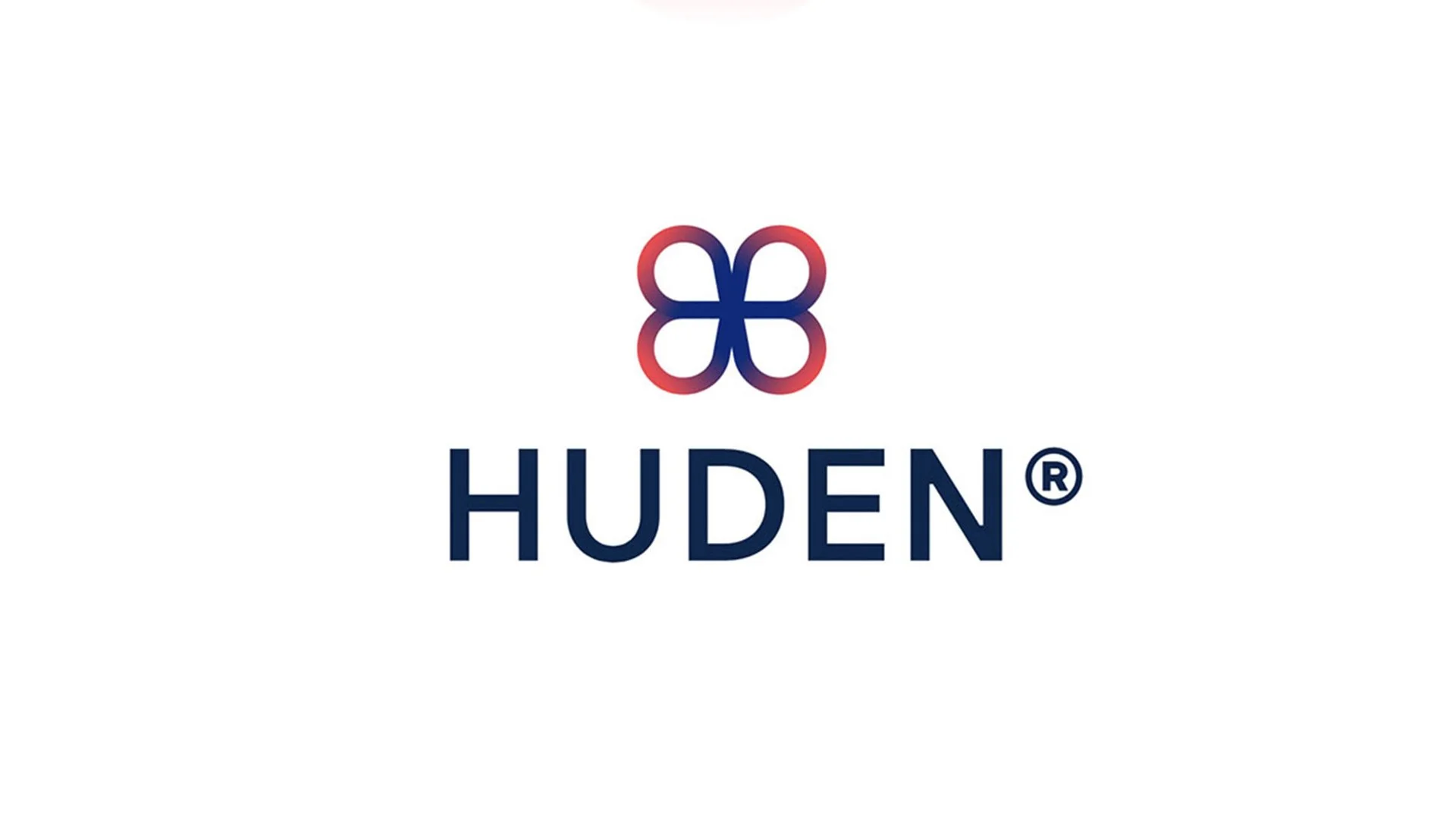
HUDEN.
HUDEN BRANDING.
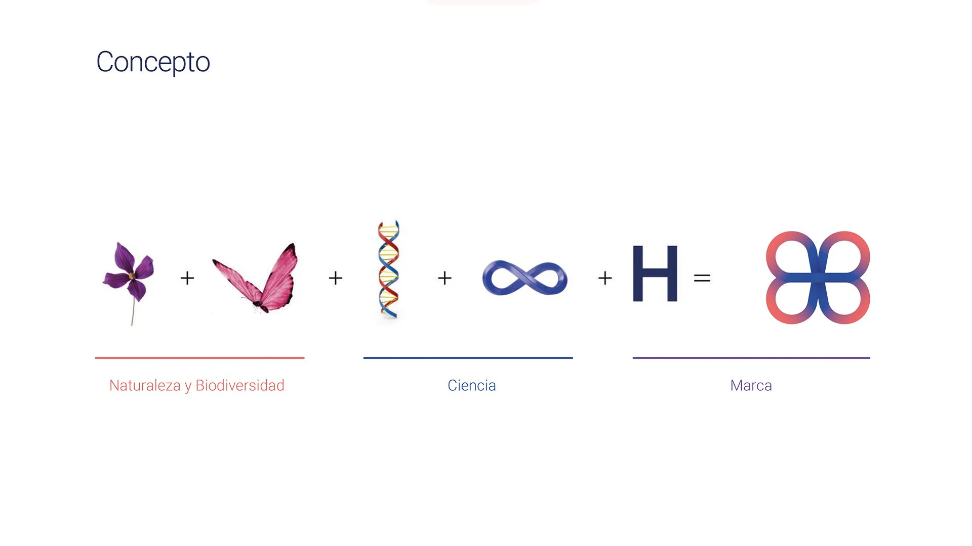
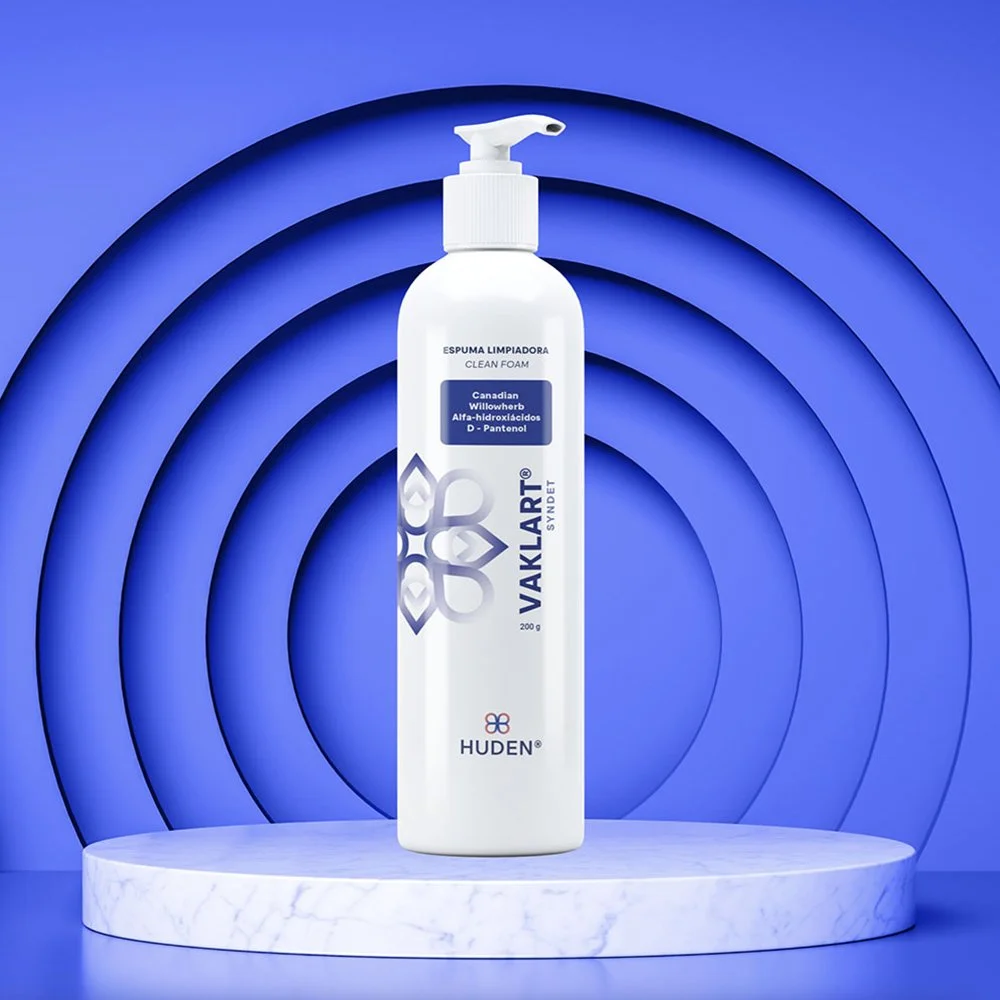
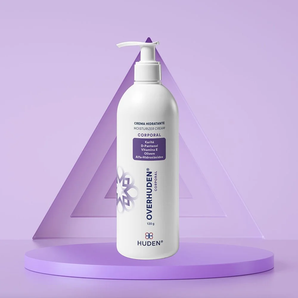
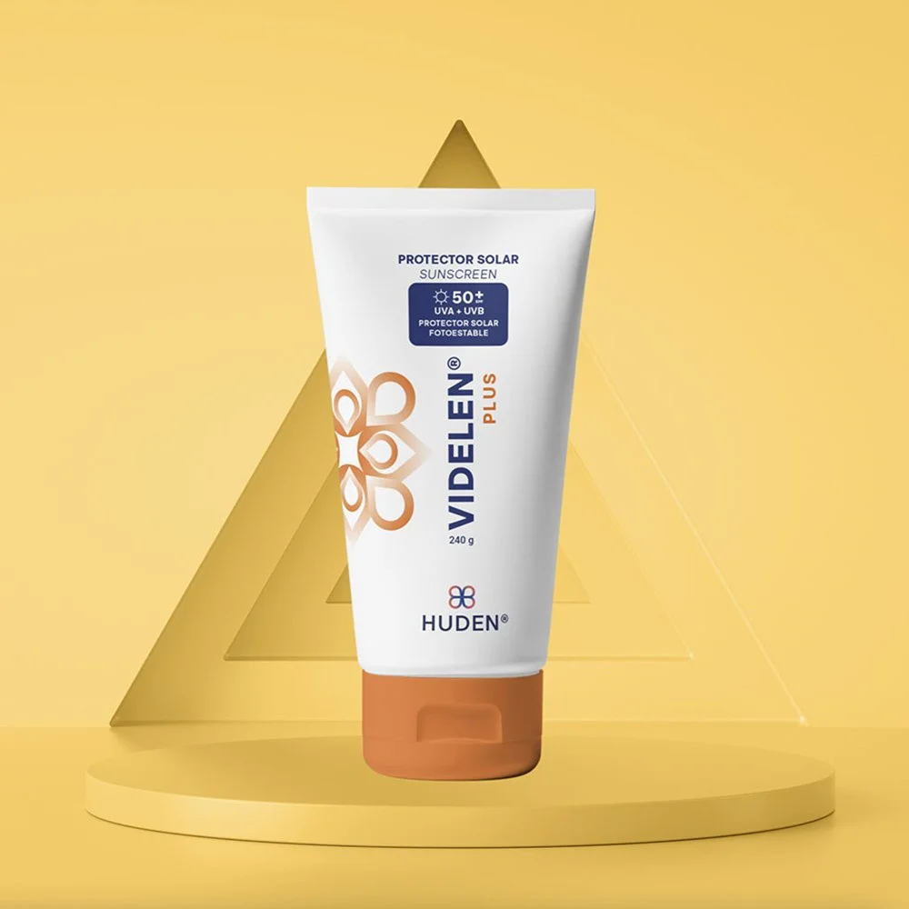
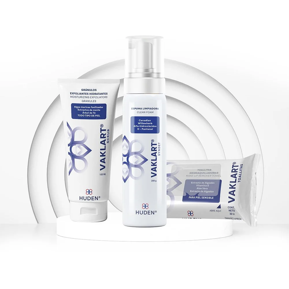
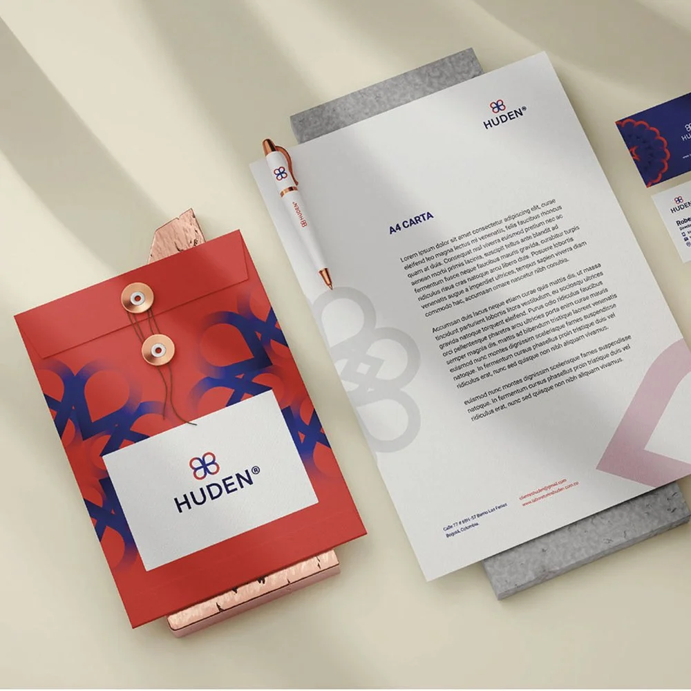
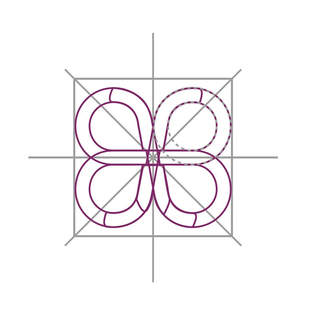
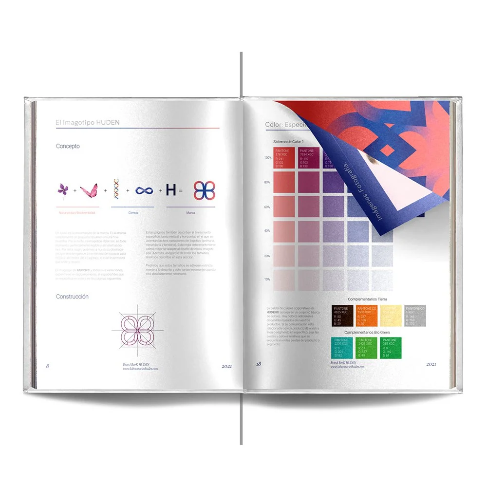
In this project, our task was to redesign the HUDEN brand, which is inspired by a planetary concept by fusing the planets Mars and Neptune around the infinity symbol, drawing its blue and red color personality from them. This fusion brings to life a universe of products for both men and women. With a pharmaceutical approach, HUDEN's products aim to stand out in the displays of skincare-focused stores.
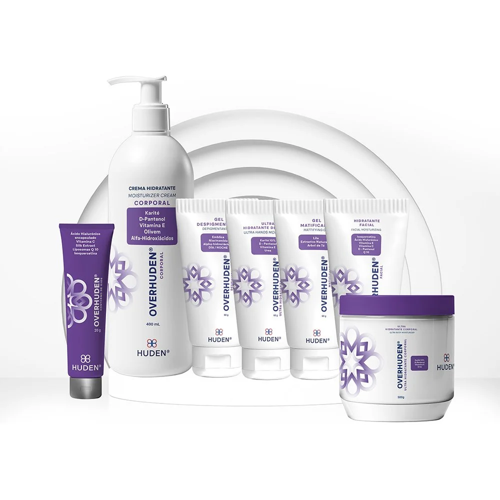
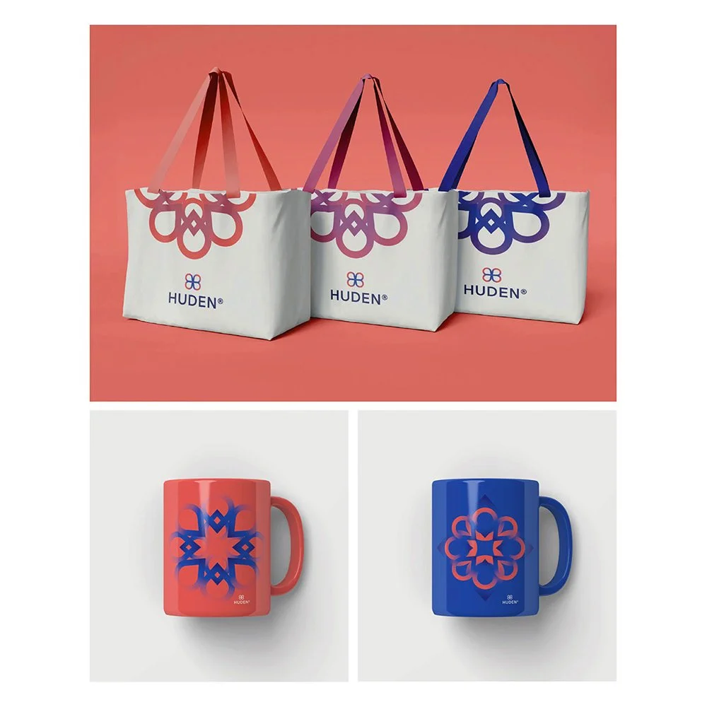
In addition to the brand redesign, we designed sub-brands for various skincare purposes, including cleansing, care, and sun protection, and I also carried out the illustration and character design for the brand's children's products. We also developed the visual look and feel of HUDEN's product packaging to create an attractive and consistent user experience.
The entire project was focused on the high-quality dermocosmetic and cosmetic industry, serving both dermatologists looking for magistral formulas and individuals seeking to care for and protect their skin with reliable products.

View More Branding Projects